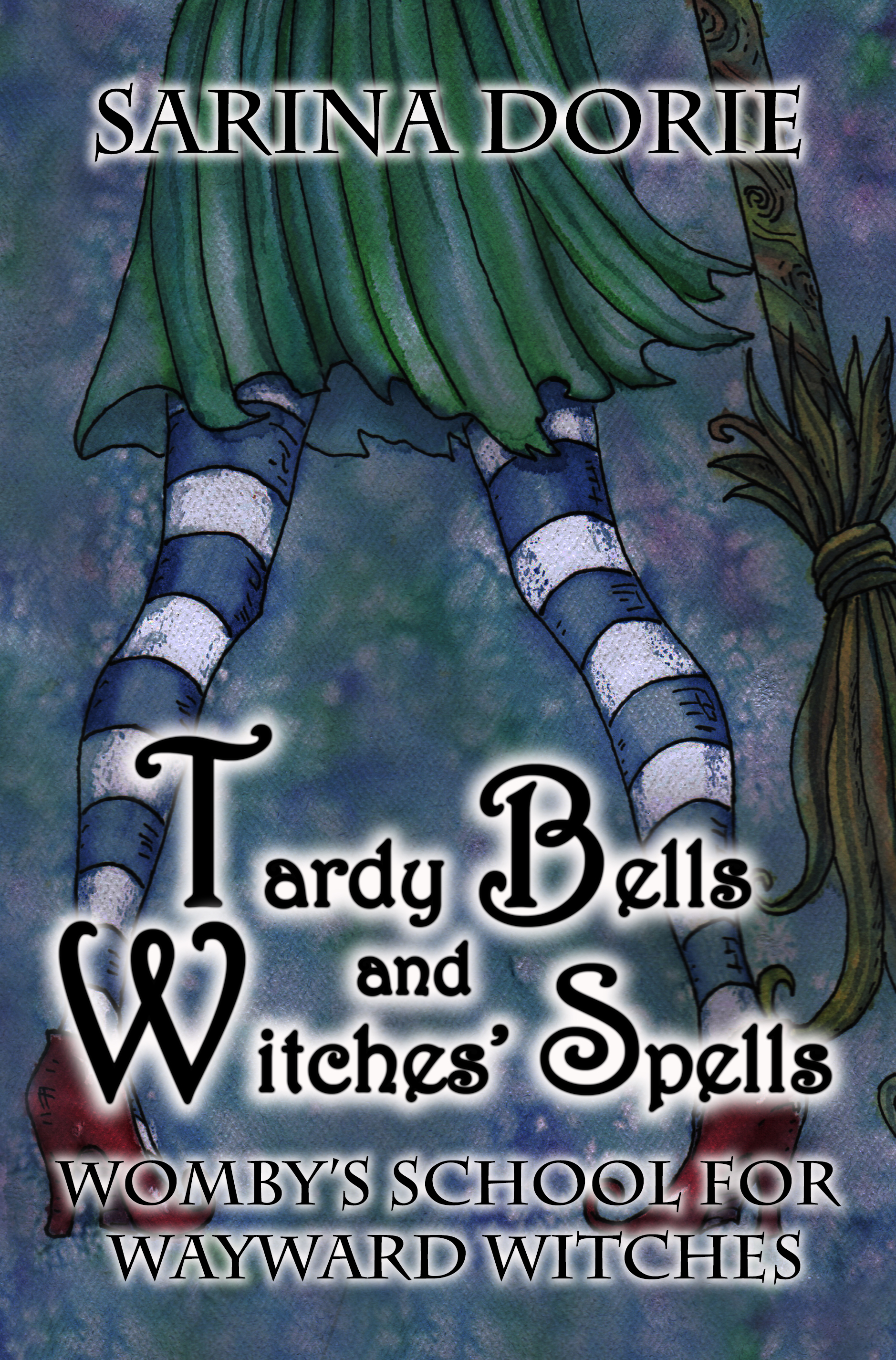
Recently I showed off the progress and process of a book cover design using my knowledge as an illustrator. I dissected the market, looked at other authors branding in the same genre, used imagery similar to other popular books but also made it different. Take a look at the process of what I did for this book cover.
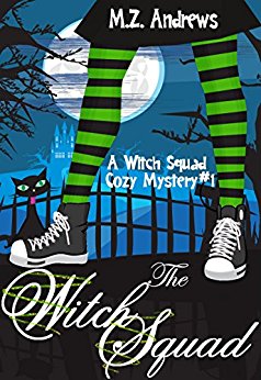
Other author images in my genre of cozy witch mysteries:

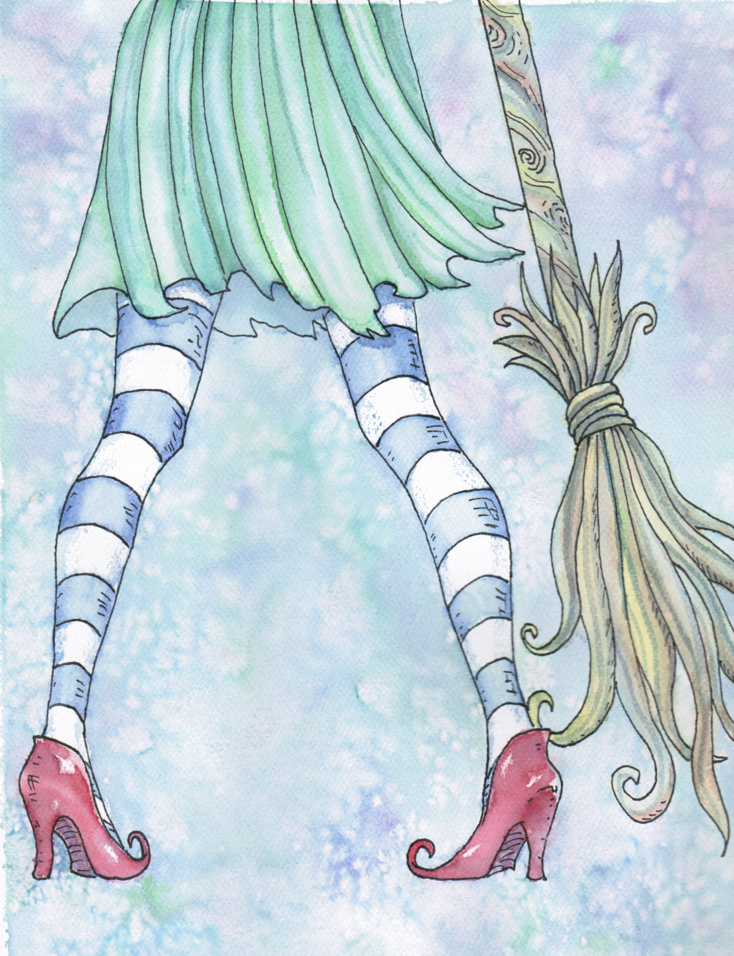
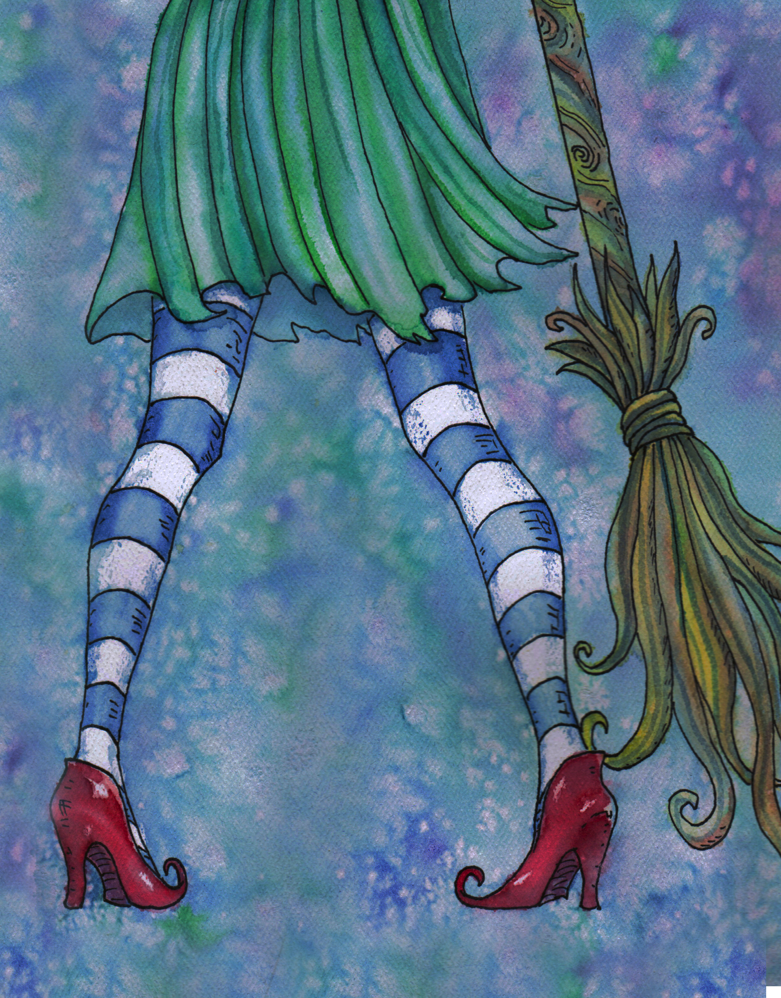
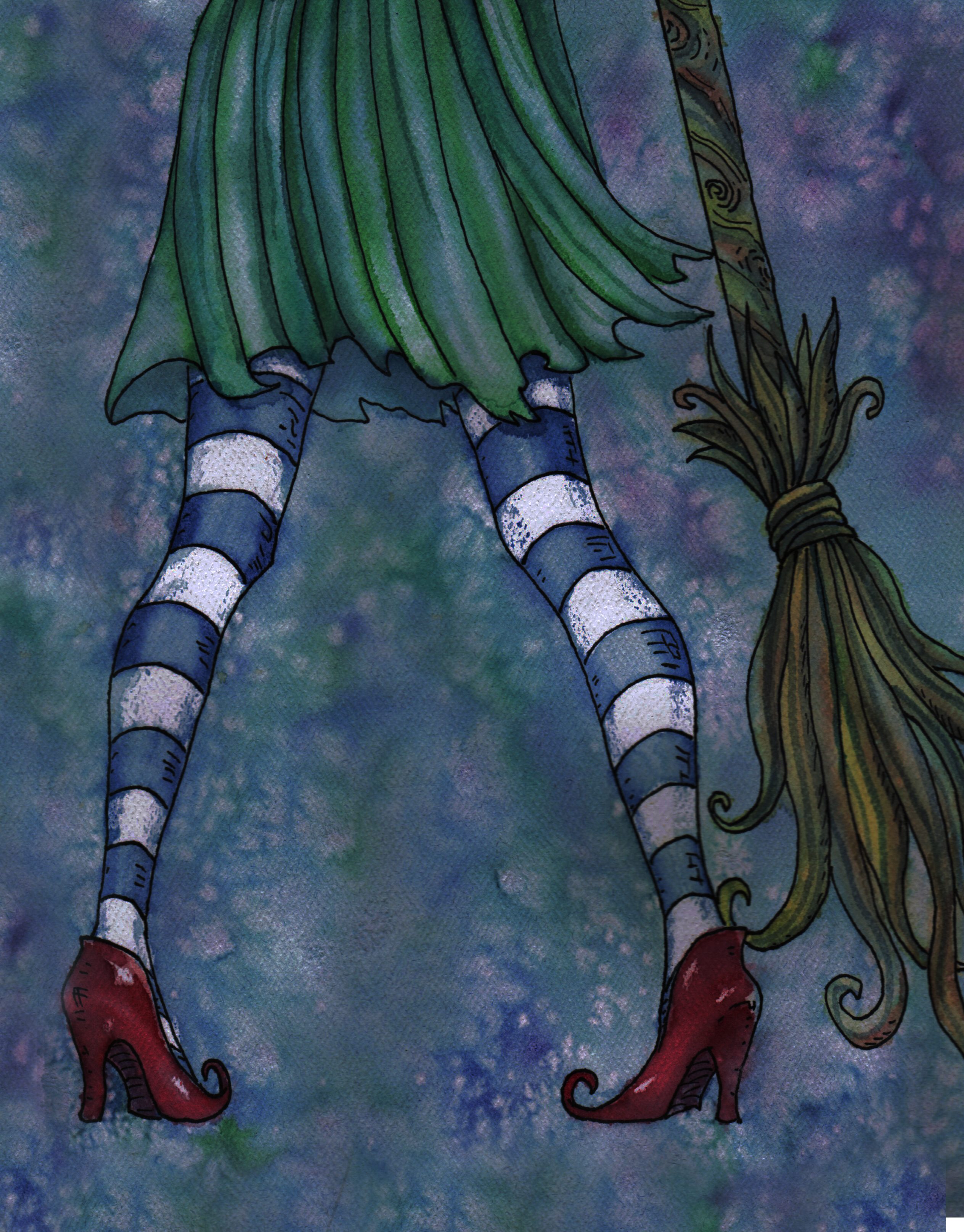
Since the artist I wanted to use for the rest of the books in the series didn’t have the imagery of a witch with striped socks and a broom in her art, I painted one of my own imitating her style. I made about six rough drafts. Here are a few.
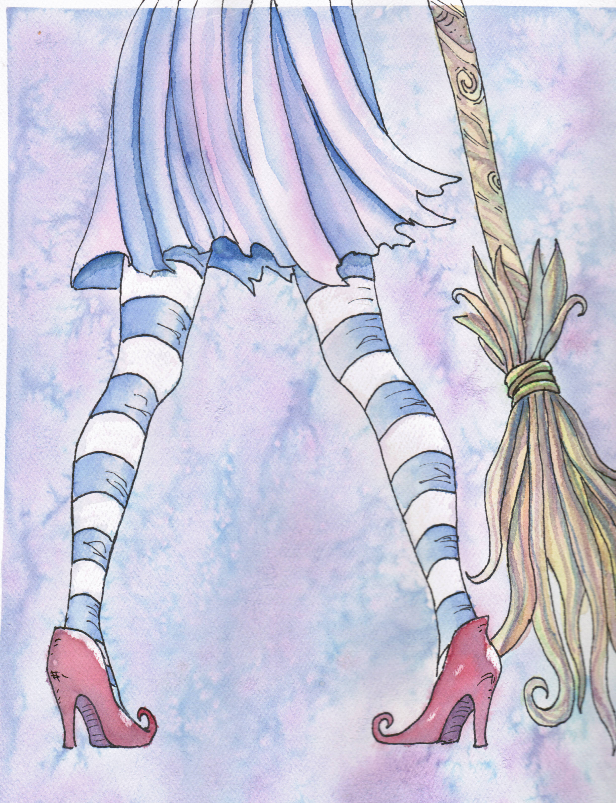
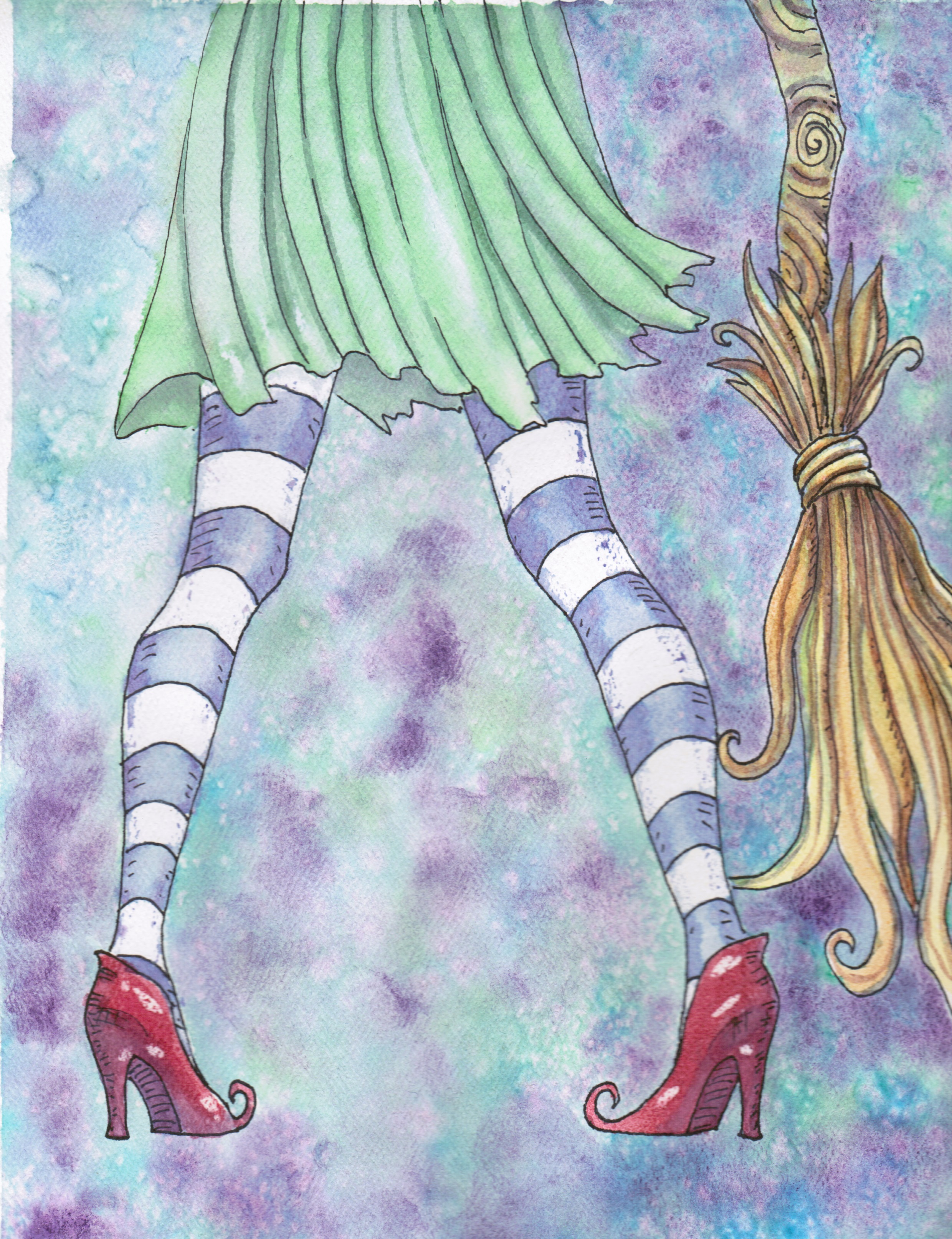
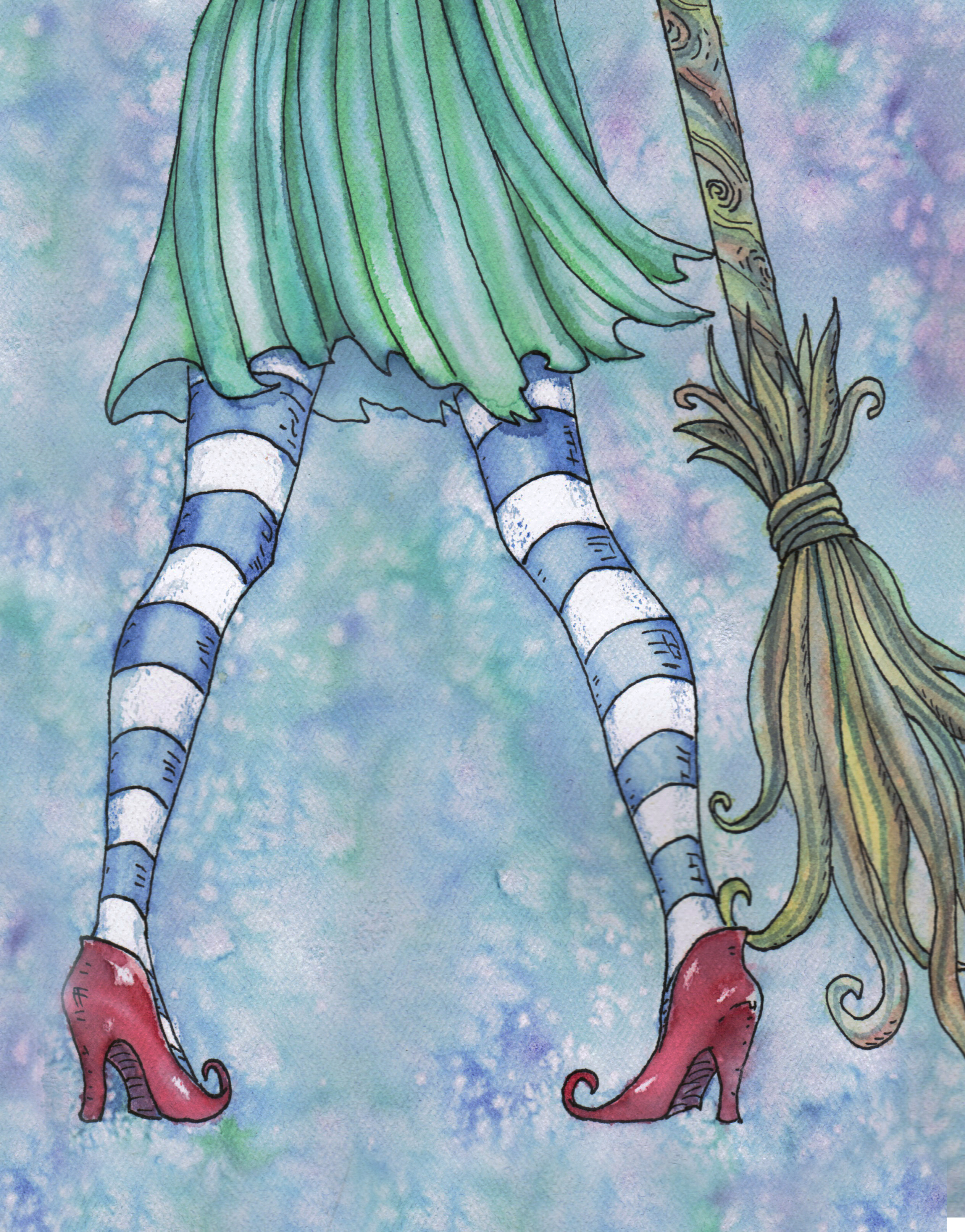
After I selected my image, I played with color, contrast, hue and saturation in photoshop to make my art less washed out and more vivid—which made it look closer to Iren Horrors artwork.
This was a lot of work and I hadn’t even gotten to the typography yet. After I figured out how vivid and dark the image needed to be, I used the same font as the other books for brand recognition.
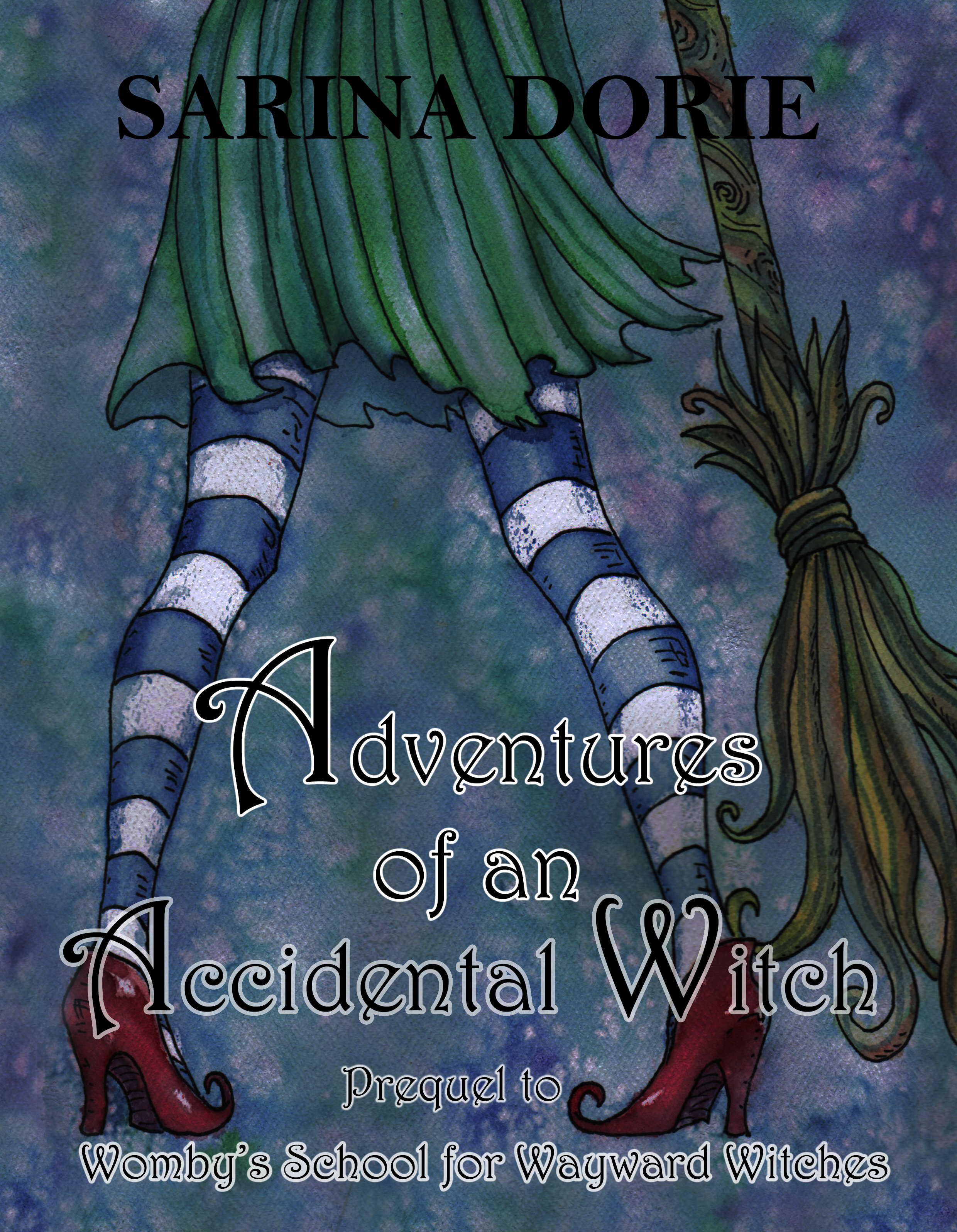
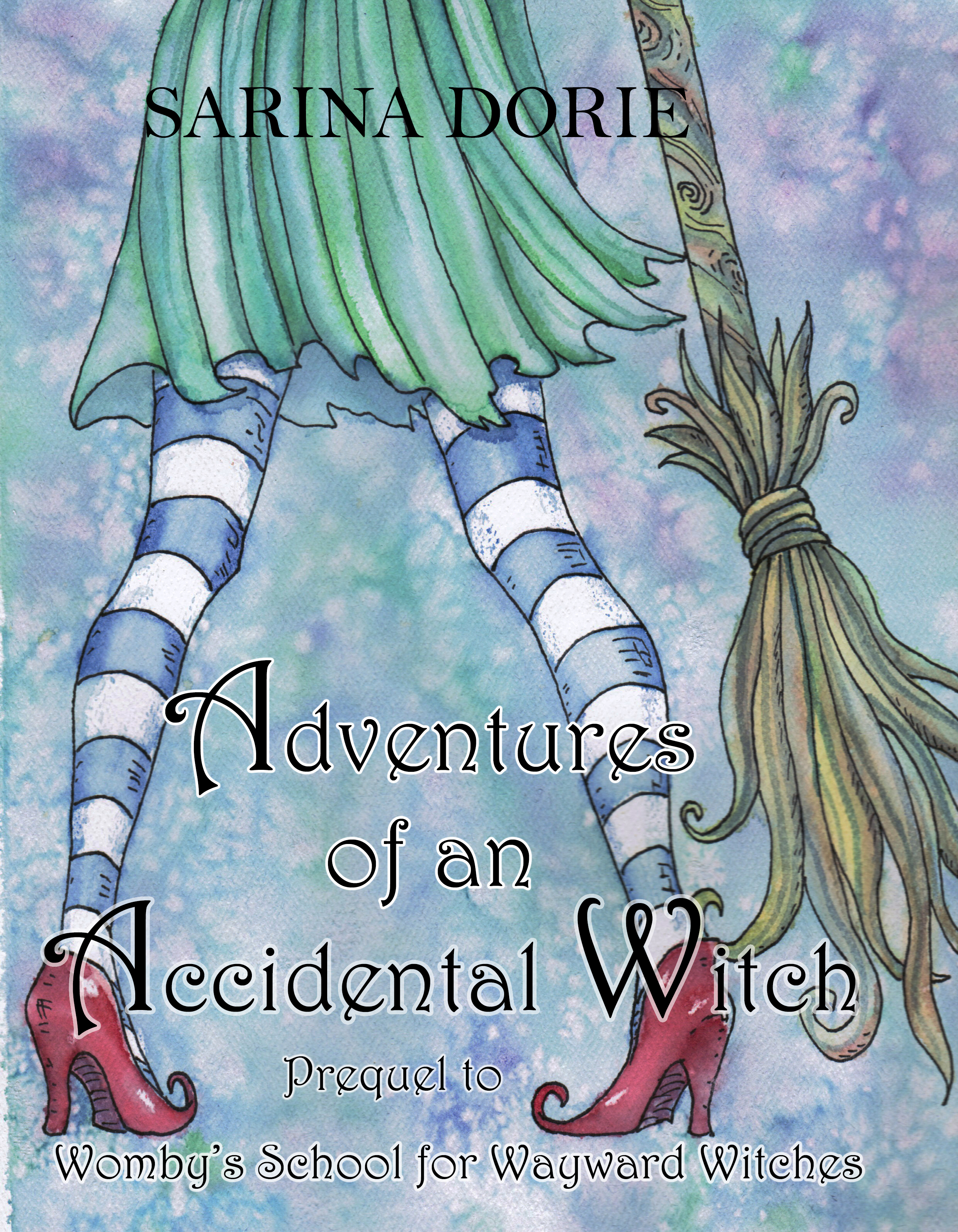
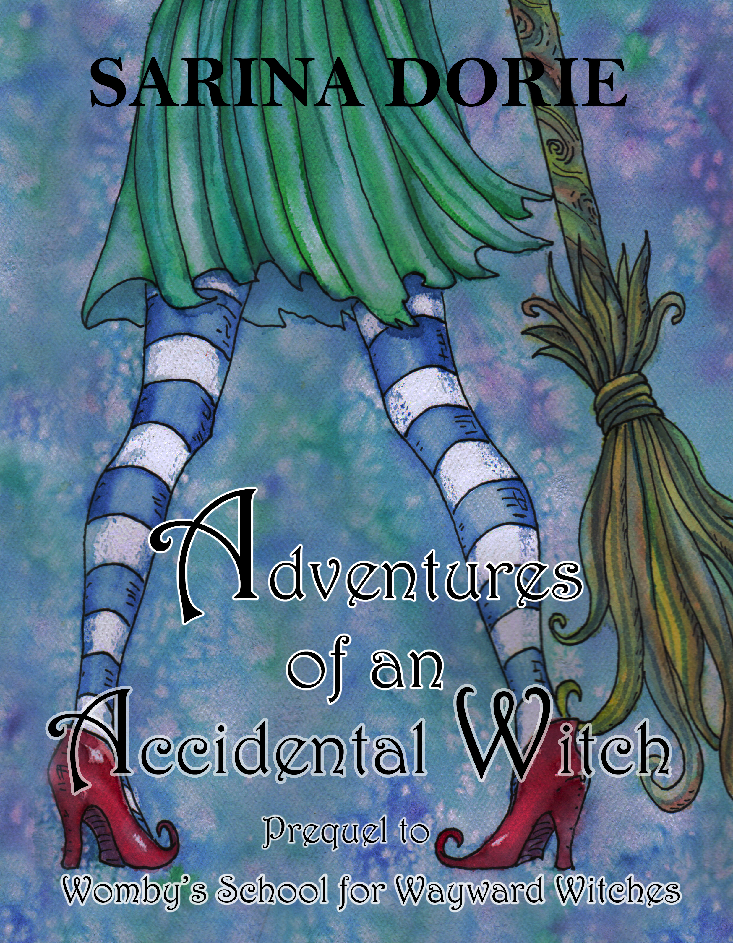
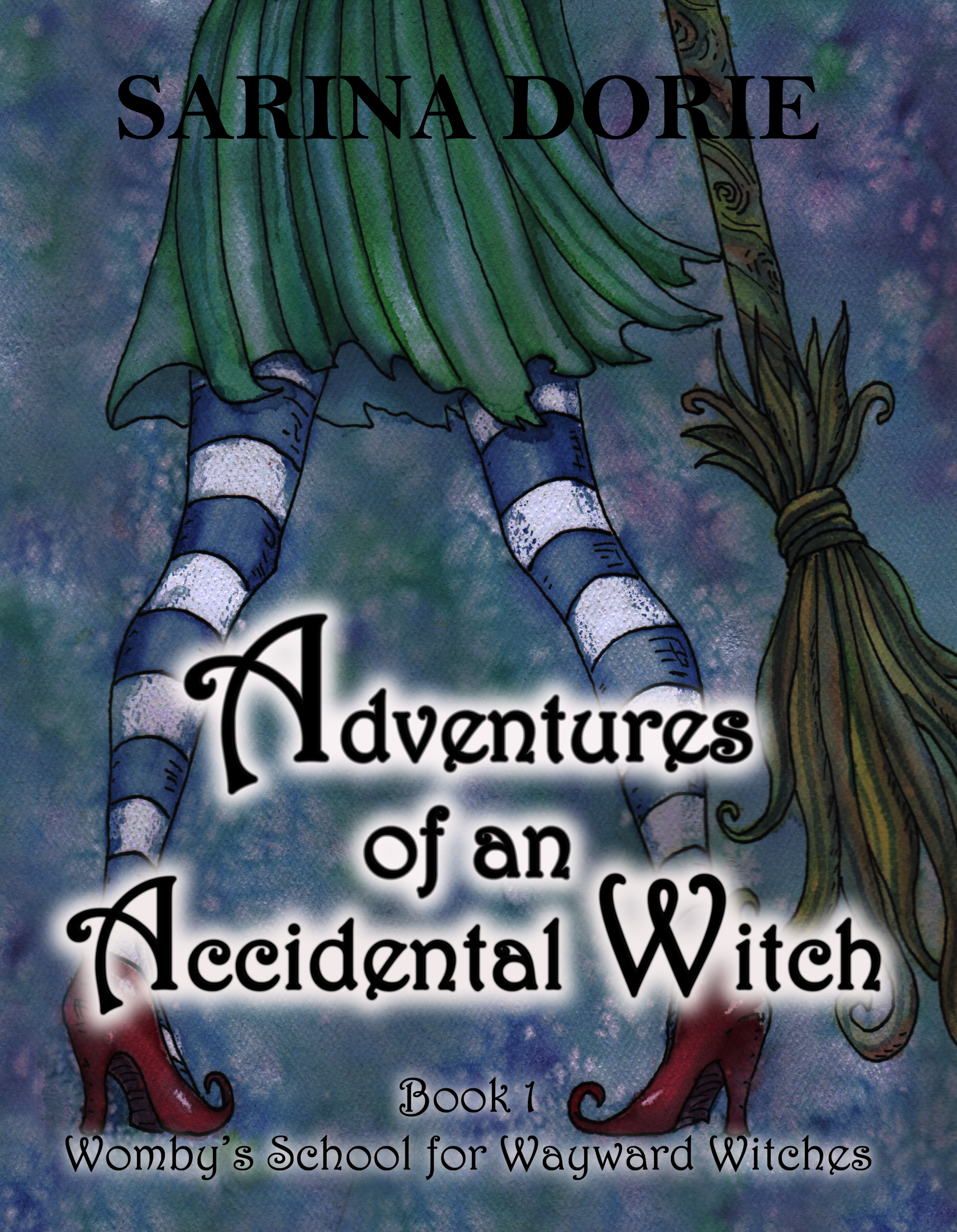
After I had everything figured out, I changed the title and had more work to do. It looks like I just skipped ahead to knowing what to do, but I actually don’t show the ten designs it took and how I spend hours with that layout and trying to figure out the white shadow. It gave me a lot of experience.